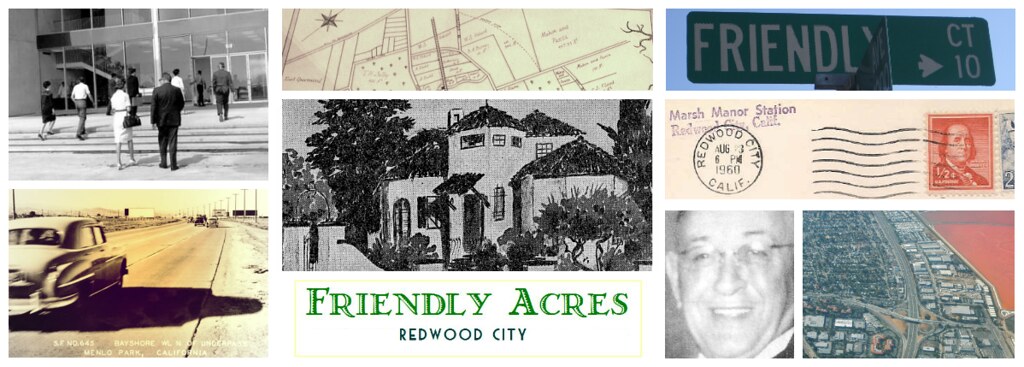
Friendly Acres in Dots
Probably one of the most interesting maps to come out in recent months is one created by Brandon Martin-Anderson who designed an interactive dot map plotting the 2010 census data for the United States.His map consists of dots - each dot representing one person. And they are mapped, based on the location address given for place of residence at the time of the census. The dots are plotted at the lowest granular level of detail available publicly, which is at the block level, according to the census reports.
Scroll down to see what the S.F. Mid-Peninsula, Redwood City and Friendly Acres all look like. Despite the tag labeling on Brandon's map, the black and white images can be difficult to work with and navigate, so for the Friendly Acres Map I juxtaposed the most detailed level of the map on top of a colored google map to make it easier to distinguish streets.
 |
| Friendly Acres Dot Map of Population Density based on U.S. 2010 Census data |


